Vladimir Golovin
Administrator
|
|
| Posted: September 12, 2007 6:53 am |
Details
E-Mail
|
Vladimir Golovin
Administrator
|
Nice work! A couple of suggestions:
1. An option for transparency would be great.
2. Finer control over the peeling areas (coverage, density etc).
|
| Posted: September 12, 2007 6:55 am |
Details
E-Mail
|
|
ahimsa

|
This is really good.  |
| Posted: September 12, 2007 7:27 am |
Details
E-Mail
|
|
Rawn (RawArt)
Texture Artist

|
Looks great, I downloaded it immediatly (as i do any distressed texture)
If I can offer a suggestion to, I would love to see optional top or bottom distressing. That would make it easier to use for texturing....and maybe an option to turn the torn effect off, just so one could get a blank wallpaper tile to help fill out the texture sets.
Rawn
|
| Posted: September 12, 2007 8:26 am |
Details
E-Mail
|
|
Kraellin
Kraellin

|
i like this idea, but i see at least two things that would keep me from using it, currently. in at least variations #2 and 3 it appears the aging is floating above the paper. and two, the high distressing seems to appear at only the top and bottom of the overall image and that's in every variation.
i love the little fine crackling; that seems to work perfectly, but the dark, larger areas need some work.
now, since someone else mentioned this, my remarks on the high distress areas are ONLY based on looking at what's on the web page here. i havent looked at the filter itself and i'm told there can be quite a difference. so, if the filter itself isnt showing that floating, then just ignore that part. If wishes were horses... there'd be a whole lot of horse crap to clean up!
Craig |
| Posted: September 12, 2007 12:15 pm |
Details
E-Mail
|
|
Mike Blackney

|
Thanks, everyone. Very good points on all counts, I'll see what I can cook up  |
| Posted: September 12, 2007 5:00 pm |
Details
E-Mail
|
|
Foxxee

|
Very nice indeed!
Looking forward to what your revision will offer too, Mike   ~Foxxee~
You are more than welcome to use and learn from my FF filters ;) |
| Posted: September 12, 2007 8:04 pm |
Details
E-Mail
|
|
ahimsa
|
Congratulations on becoming Editor's Pick!   |
| Posted: September 13, 2007 5:32 pm |
Details
E-Mail
|
|
Mike Blackney
|
Goodness! That was unexpected!
Thanks, Ahimsa
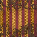
Here's what it looks like in Unreal Engine 3:
 |
| Posted: September 13, 2007 6:27 pm |
Details
E-Mail
|
|
ahimsa
|
That looks really good and run down.
When I got mine it was very unexpected. I'm still amazed that one of mine actually got EP. |
| Posted: September 13, 2007 6:30 pm |
Details
E-Mail
|
|
onnetz

|
congrats.. man your just crankn em out.. |
| Posted: September 13, 2007 7:57 pm |
Details
E-Mail
|
Vladimir Golovin
Administrator
|
| Quote |
|---|
Mike Blackney wrote:
Here's what it looks like in Unreal Engine 3: |
Try to lower Surface Height (on the Lighting tab) to 5 or 10 instead of 20 before generating normal maps -- this will make the peeling more realistic.
|
| Posted: September 14, 2007 3:24 am |
Details
E-Mail
|
|
Mike Blackney
|
| Quote |
|---|
Vladimir Golovin wrote:
Try to lower Surface Height (on the Lighting tab) to 5 or 10 instead of 20 before generating normal maps -- this will make the peeling more realistic. |
That's a good idea. I rendered using a height of 20 and then did a 50% blend with a normal map I generated from the diffuse, but I think I fell for the old trap of wanting to show off all the detail I'd put in at the cost of realism and it... erm... looking nice 
|
| Posted: September 17, 2007 8:41 am |
Details
E-Mail
|