|
Darth Axel 007
Darth Axel 007

|
|
| Posted: June 25, 2007 7:49 pm |
Details
E-Mail
|
|
Darth Axel 007
Darth Axel 007
|
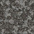
The destroyed scraps of metal corrosion etc on top look very realistic. Just add grain/roughness to the back layer for realism. Good work.
Variation 5 is my favorite, good use of patterns.
|
| Posted: June 25, 2007 7:50 pm |
Details
E-Mail
|
|
ahimsa

|
Thank you
|
| Posted: June 26, 2007 10:35 pm |
Details
E-Mail
|
|
Kraellin
Kraellin

|
i think maybe you picked the wrong default there, ahimsa, but then that's always kind of a personal choice thing. very good corrosive effect. i like it  If wishes were horses... there'd be a whole lot of horse crap to clean up!
Craig |
| Posted: June 27, 2007 1:43 am |
Details
E-Mail
|
|
ahimsa
|
Yeah, I think so too. Hans says it looks pink, on my monitor it looks coppery.
|
| Posted: June 27, 2007 2:07 am |
Details
E-Mail
|
|
Kraellin
Kraellin
|
kinda pinkish on mine too and very little grain. if it's supposed to be metal plate it would have a bit more roughness to it, especially with the corrosion all around. but i do like that corrosion effect. If wishes were horses... there'd be a whole lot of horse crap to clean up!
Craig |
| Posted: June 27, 2007 2:17 pm |
Details
E-Mail
|
|
ahimsa
|
My monitor is going bad so that is probably why the color is different for me. I have lines on the side of this monitor that are always swimming. 
I will see what I can do to change those two things. Thanks for the feedback. |
| Posted: June 27, 2007 4:22 pm |
Details
E-Mail
|
|
ahimsa
|
Here is what I have so far.
|
| Posted: June 27, 2007 11:52 pm |
Details
E-Mail
|
|
Kraellin
Kraellin
|
yup, that looks better If wishes were horses... there'd be a whole lot of horse crap to clean up!
Craig |
| Posted: June 28, 2007 2:42 pm |
Details
E-Mail
|
|
ahimsa
|
Ok, thanks, I will resubmit it. And look, no pink (copper to me) |
| Posted: June 28, 2007 2:51 pm |
Details
E-Mail
|
|
Kraellin
Kraellin
|
yup. pink metal is almost an oxymoron If wishes were horses... there'd be a whole lot of horse crap to clean up!
Craig |
| Posted: June 28, 2007 2:59 pm |
Details
E-Mail
|
|
Carl
c r v a

|
Preset one and the default looks excellent as a metal texture, I like how your filter are developing more randomness |
| Posted: June 29, 2007 11:28 am |
Details
E-Mail
|
|
ahimsa
|
Thank you Carl. Still learning how to use the components. |
| Posted: June 29, 2007 4:23 pm |
Details
E-Mail
|
|
jffe
|
I liked this one too when I saw it as a new filter the other night. Very tasteful choices for the colors of the presets helped. And not to ruin this thread, but again, sorry for any misunderstandings previously. Any harsh words from me, were derived from my attitude toward situations more than toward individual people, and some if not most, of the misunderstandings, very well could have been, or were, my own.
jffe Filter Forger |
| Posted: June 30, 2007 5:37 pm |
Details
E-Mail
|
|
ahimsa
|
Thanks jffe. It's been very depressing for me because of what happened. You know now that Hans really is a seperate person. He has commented on my work for years and I on his. I asked him not to comment on mine here anymore. His demo expired and he didn't ask for a renewal. I don't plan on asking for another one either.
|
| Posted: July 1, 2007 3:58 pm |
Details
E-Mail
|
|
Presidio
Presidio

|
|
| Posted: August 7, 2007 9:27 pm |
Details
E-Mail
|
|
StevieJ
Designer/Artist

Posts: 11264
Filters: 163
|
I REALLY like the effects starting from variation #1 (preset #2).....because of the simplicity of the corrosion from that one. Nice work!!! Steve
"Buzzards gotta eat...same as worms..." - Clint :) |
| Posted: August 8, 2007 2:32 am |
Details
E-Mail
|