|
Vladimir Golovin
Administrator |
||
| Posted: November 7, 2006 7:27 am | ||
|
Vladimir Golovin
Administrator |
Sjeiti, great filter! I'd recommend to tighten up the controls (for example, 'Framed' is not necessary in my opinion).
|
|
| Posted: November 7, 2006 7:29 am | ||
|
Vladimir Golovin
Administrator |
Or maybe I was wrong about removing of the Framed control -- it certainly helps in some cases.
|
|
| Posted: November 7, 2006 11:02 am | ||
Sjeiti
 |
Wel, I do agree that it could lose the framed-option: I have a version here that uses the Selection component instead of the frame-option. But the downside is that if you don't have a selection you get the bit yellow warning: 'This filter requires a selection', while a selection is not compulsary (feature wish).
A possible change is deleting the shadow checkbox, also I'm not sure wether to keep the shadow or delete it altogether (would speed it up a little). Another change I have ready is a Refraction component instead of an Offset component for refraction. I'll wait for some feedback first before submitting the changes. Anybody with an opinion here? 
|
|
| Posted: November 7, 2006 12:44 pm | ||
Crapadilla
 |
Lovely filter!
I'd say keep the shadow and do away with the frame option. Also, I think the offset is preferable over refraction as it is faster. Controls could be simplified and reordered a little... --- Crapadilla says: "Damn you, stupid redundant feature requests!" ;) |
|
| Posted: November 27, 2006 11:00 pm | ||
| jffe |
Wow, complex guts on this one. I found a little cheap-o work around for a similar filter just this morning. I'll be interested in seeing how you have your new Splatter filter wired though, even though I couldn't figure out the original enough to steal any of the wiring ha-ha.
jffe Filter Forger |
|
| Posted: December 3, 2006 2:49 am | ||
|
Sjeiti
|
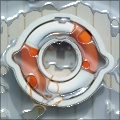
Well, the height/refraction was the only really tricky part.
The new version won't change much apart from a new splashy part I'm trying to insert (see image below). It's a bit of a pain because of the detail (there's still some flatness in the upper part of the splash). And I'm still not sure wheter I want that yellow warning or not.  |
|
| Posted: December 3, 2006 1:48 pm | ||
|
Crapadilla
|
I like the 'splashy part'...
--- Crapadilla says: "Damn you, stupid redundant feature requests!" ;) |
|
| Posted: December 3, 2006 2:08 pm | ||
| James |
I thought i posted on this one already but i guess not
|
|
| Posted: December 9, 2006 4:08 pm | ||
|
Crapadilla
|
Congrats on the reward. Well deserved!
--- Crapadilla says: "Damn you, stupid redundant feature requests!" ;) |
|
| Posted: December 19, 2006 1:20 pm | ||
|
Sjeiti
|
reward?!... oh wow... hadn't even seen that yet
 |
|
| Posted: December 19, 2006 4:40 pm | ||
|
btchnigg
Posts: 1 |
i dont know how to use this plz help. i cnt evn put one splash on my image. giv me da one by one step tnx.
|
|
| Posted: September 3, 2007 3:30 am | ||
Join Our Community!
Filter Forge has a thriving, vibrant, knowledgeable user community. Feel free to join us and have fun!
33,826 Registered Users
+9 new in 30 days!
153,744 Posts
+15 new in 30 days!
15,384 Topics
+5 new in 30 days!
Online Users Last minute:
22 unregistered users.
Recent Forum Posts:
- Ancient Free Packs!! by Shayne
2 days ago - Chaos Fields by Rachel Duim
July 17, 2026 - Double Mosaic by Ramlyn by Ramlyn
July 9, 2026 - New awesome TEXT component FF 14 - How to get the most of it? by CFandM
July 8, 2026 - Variable Kaleidoscope by inujima by SpaceRay
July 6, 2026 - Question about Upgrading to newest version by GMM
July 6, 2026 - Guide on how to use texture maps PBR export with Filter Forge for 3D by SpaceRay
June 24, 2026 - PBR work flow...? by SpaceRay
June 24, 2026 - Unleashing creativity art with the help of filter forge 11 by EAdams
June 14, 2026 - FF 11 and FF 12 Studio animations that could maybe be done I think by CFandM
June 8, 2026 - BB - BubbleBlocks by Ramlyn by Ramlyn
June 2, 2026 - Dragon Distort II by Wolfgang Halder by Wolfgang Halder
June 1, 2026