|
SpaceRay
|
||||||
| Posted: August 8, 2013 10:43 am | ||||||
|
SpaceRay
|
Hello, I have a new filter that have been doing since long time ago, and now finally I could finish it as I wanted to give it much more movement, and not just a plain representation of photo overlaid over text letters. Now I have shown on the 20 presets many of the possible variations from still and quiet text, to chaotic order. And also you can get a lot of combination more using the different blend modes.
Thanks to ThreeDee for having made possible to have this beautiful letters inside FF (this ones are the older ones not the Arial) as I have already built this before the new ones appeared. Read the about text to know more. Thanks This is the plain and simple default preset  |
|||||
| Posted: August 8, 2013 10:49 am | ||||||
|
SpaceRay
|
Here is the same as above but in higher resolution so see it better
 |
|||||
| Posted: August 8, 2013 10:51 am | ||||||
|
SpaceRay
|
Also you can try different combination with the 5 invert checkboxes as they can give different styles when mixing them and see what happens when on/off
This is preset 11 but with all the invert checkbox not active  |
|||||
| Posted: August 8, 2013 10:53 am | ||||||
|
SpaceRay
|
Now let´s begin to move the letters a little, so they are not straight and fixed
This is preset 9  |
|||||
| Posted: August 8, 2013 10:57 am | ||||||
|
SpaceRay
|
Now lets move them much more
Custom preset where the values are shown (maybe I could include this one instead of another preset) Inverting some and some others not, gives the effect that all is not filled with letters, specially on the white parts.  |
|||||
| Posted: August 8, 2013 11:01 am | ||||||
|
Rod_D
|
I like it. Nicely done.
I love the 3d'ish effect on the letters. Rod
|
|||||
| Posted: August 8, 2013 11:01 am | ||||||
|
SpaceRay
|
This is the reason it has taken longer to make. Now let´s shake and move them much more like crazy and switch the stirring letters machine
This shown here is preset 12 (now is 13 but I will change it in the next update)  |
|||||
| Posted: August 8, 2013 11:05 am | ||||||
|
SpaceRay
|
And here is the same as above closer to see better the details in higher resolution
I like much how the shapes of the letters are mixed this way to create an artistic texture.  |
|||||
| Posted: August 8, 2013 11:09 am | ||||||
|
SpaceRay
|
Thanks, glad you like it. The 3´dish effect you probably mean is that the letters have shading styles, and with setting number 4 is the best, and this is thanks to Skybase for the idea I have seen in the Gradient Circles filter. |
|||||
| Posted: August 8, 2013 11:22 am | ||||||
|
SpaceRay
|
Now for another example let´s get less crazy and move the letters in another way
This is preset 6 |
|||||
| Posted: August 8, 2013 11:23 am | ||||||
|
SpaceRay
|
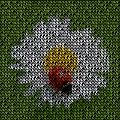
With the same preset 6, but changing the source image so it has lots of different colors that will show through the letters and using a very dark background to make them stand out more
|
|||||
| Posted: August 8, 2013 11:26 am | ||||||
|
SpaceRay
|
And using the same Preset 6 but using a grunge textured colored stripes to overlay over the letters and have this nice result shown here
|
|||||
| Posted: August 8, 2013 11:30 am | ||||||
|
SpaceRay
|
Now let´s go quiet and calm again and show it BIG!
Using the same grunge colored stripes as above but using Preset 2 This has some letters mixed with some inverted and some not inverted (this the default of preset 2) |
|||||
| Posted: August 8, 2013 11:35 am | ||||||
|
SpaceRay
|
And for last using the same source as above but using preset 9 to go crazy again
|
|||||
| Posted: August 8, 2013 11:45 am | ||||||
|
SpaceRay
|
And the very last one for now is one that may be more useful for applying letters over any other previous texture or artistic image
|
|||||
| Posted: August 8, 2013 11:53 am | ||||||
|
SpaceRay
|
LEGAL NOTE OF THE ABOVE IMAGES
As I have seen that there are some people that take some images from forums and other places, and then make commercial works with them, I want to say that I have the copyright of the images above and is not allowed in any way to use any of the above images outside of this forum, these ones have an embedded digital watermark, so please, do not use them for anything else. Thanks very much. |
|||||
| Posted: August 8, 2013 11:54 am | ||||||
Skybase
 |
lol ugh SpaceRay, those giant red embossed watermarks just take away from the viewing experience, they're just *ahem* ugly. You should make them white and semi-transparent and keep the position consistent. Part of the art of signing your work is how you can make the signature appear bold (bold meaning how you're the creator of the image) and presentable but not invade the image. Stock websites reserve the right to put giant, semi-transparent watermarks. But we're here to look at your work, not feel your presence in the giant watermark. Also regarding the digital watermark, what did you use?
And neat filter |
|||||
| Posted: August 8, 2013 8:48 pm | ||||||
|
Ozmandias
Posts: 88 |
As someone who has had images stolen myself, I completely understand SpaceRay's addition of obvious watermarks and have no problem looking beyond them to see the images.
|
|||||
| Posted: August 8, 2013 9:40 pm | ||||||
|
Skybase
|
Ozmandias, honestly, I wouldn't have much issue either. It's not "that bad". I'm more like on the role saying it can be better designed and consistent. It's just a nice, considerable thing to do for not only yourself but the viewers. It's just good practice making a well designed watermark than something that invasively claims rights.
This whole conversation stems from the time when my former boss asked me, "Do you think this artist is afraid of the world? Or is he being cautious and careful like the rest of us?" He shows me this picture of somebody's painting, and it's got a giant green watermark on it. He mumbled, "That's just wrong. The painting's beautiful, but this watermark is sending a different message. Don't you think?" I think later that day he sent an email to the artist. And our in-house designer made a nicer, easy-to-deploy watermark for that guy at no cost. The artist later sent us a painting with a thank you note. I'm very certain he benefited greatly from a small difference like such. My boss likes that painting. My point being, worry about your creative content of the art as much as the image itself. The watermark is your brand and your signature, it should live with your image, not invade it. Interpretation by a third party is inevitable, we only get an image to work out your interests, feelings, and the message. Signatures and watermarks carry messages as much as the work itself, whether that's interpreted correctly or not is up to how they are portrayed. It can say a lot! But yeah... please excuse my professional side of life pouring out. No, the watermarks are fine if they intend to be like that. I'm just perhaps being overly critical given my past experiences. |
|||||
| Posted: August 8, 2013 11:41 pm | ||||||
|
SpaceRay
|
Thanks very much for the FF team that works for the FF Facebook page that have included my filter as "Today´s choice"
Oh, Sorry that I did have to do this, and that you do not like them, but there is a problem, HOW do you make a white and semi-transparent watermark over a mostly white typographic pattern? My first intention was to make it this way, but it did not work at all, and you could not see it, and it was even more ugly and it was a mess that confused it more and was bad. I will make another separate post to speak about all the many things I know about watermarking, as I have made a long investigation through internet, books and magazines about this topic and have learnt a lot of things about it. Also will tell also why I have put this watermarks here.
Sorry that I can´t tell what I have used, because if you know which one is it, there is a way to take it out or avoid it, and so I can´t tell, I can tell that I did not use the Digimark because is expensive and can´t pay for that. |
|||||
| Posted: August 9, 2013 8:59 pm | ||||||
|
Skybase
|
Hah, digimark is indeed pricy.
Yeah, in the end, I'm really really just trying to get you to design your watermarks. You don't have to follow my advice on what designs they should appear like. At least the colors work in your favor for these. I think it's fair to say that you've done part of your job. But to me, emboss, stroke, drop shadow appear "default" in my eye. In the industry, I just see it as a "slap on job". It's not representing you in the positive light in terms of design. Give it more experimentation and some time. I'd say there are so many more techniques for cleaner watermarking you can always exhibit as a good job. Like I say, everything in that picture tells a story. Watermarks also tells a story of what you think about the rest of the world. It's another view into you and it shouldn't misrepresent you as a person. Watermarking to me isn't just about protecting your work, it's about your "Being", your psyche, and your interpretation of the world at large, as much as what you're afraid of (image theft, abuse, reuse... so on). There's a lot of things an image can tell me. |
|||||
| Posted: August 9, 2013 9:45 pm | ||||||
|
SpaceRay
|
I have to say that I have already made my own watermarks in a photoshop action to be applied easily to any image, but this ones are only for images that are mine and will be possibly for sale if I have any success selling them.
Thanks for your advice and is good and helpful, especially from a professional like you I have to say that I really did not care much about making the watermarks for this images above, and made this ones as shown,because I thought it was not important, as these are only examples to show what can be done with this filter and not a exhibition of works |
|||||
| Posted: August 12, 2013 3:17 am | ||||||
EAdams

Posts: 448 |
This is a beautiful filter that is also really nice to use as a texture for a simple black and white image.
 |
|||||
| Posted: April 26, 2014 8:29 am | ||||||
|
Tepearley
|
Very cool SpaceRay! It has a lot of creative potential as does the extended version!
 |
|||||
| Posted: April 26, 2014 6:43 pm | ||||||
|
SpaceRay
|
I still love this filter and like much the typographical effect it gives, although seems that people do not think the same as it has a low rank, but I still think is great
|
|||||
| Posted: January 4, 2016 2:43 am | ||||||
|
SpaceRay
|
I have thought about making a variation where instead of simply overlaying the source image into the letters, it could paint each letter fully in one of colors of the source image, but will have to see how to do it as yet I do not know
I remember the there are some filters with cubes that had this option available of coloring only one of the particles of bomber with source image colourbert by Mongoose King Artistic Deep cube 6 by Ramlyn Cubeaholic by tigerAspect |
|||||
| Posted: April 3, 2016 12:51 pm | ||||||
Join Our Community!
Filter Forge has a thriving, vibrant, knowledgeable user community. Feel free to join us and have fun!
33,820 Registered Users
+14 new in 30 days!
153,732 Posts
+17 new in 30 days!
15,381 Topics
+5 new in 30 days!
Online Users Last minute:
36 unregistered users.
Recent Forum Posts:
- Guide on how to use texture maps PBR export with Filter Forge for 3D by SpaceRay
June 24, 2026 - PBR work flow...? by SpaceRay
June 24, 2026 - Chaos Fields by Ramlyn
June 21, 2026 - Unleashing creativity art with the help of filter forge 11 by EAdams
June 14, 2026 - FF 11 and FF 12 Studio animations that could maybe be done I think by CFandM
June 8, 2026 - BB - BubbleBlocks by Ramlyn by Ramlyn
June 2, 2026 - Dragon Distort II by Wolfgang Halder by Wolfgang Halder
June 1, 2026 - Multi Refraction by aaron Harris by SpaceRay
June 1, 2026 - Flashing Messages 3x6 by Rachel Duim by SpaceRay
May 28, 2026 - New awesome TEXT component FF 14 - How to get the most of it? by SpaceRay
May 28, 2026 - Just dropping in to say by Rachel Duim
May 24, 2026 - Veggie Rock by Vanblam by dactilardesign
May 22, 2026